Transparent Text
9 minute read •
It’s been almost three months since I posted the last Neatpad tutorial, and it’s also been over a year since I started this project. During this time I have been steadily working on the migration to the Uniscribe API. Alot of issues have become apparent with the way I am rendering text in Neatpad, so this tutorial will hopefully highlight these issues and offer a solution. There isn’t going to be any code-download this time as I will be incorporating the ideas presented here into subsequent tutorials (which will be about Uniscribe).
Rendering text
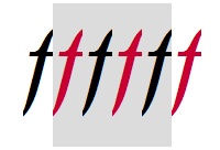
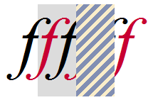
So before we start looking at Uniscribe I want to take a moment to re-examine the process of text rendering. This is not going to be a very in-depth discussion - rather it will be an overview of text-rendering in general. As the basis for our discussion a single letter ‘F’ in italics will be used, as shown below.

The image shows a black glyph, representing the lower-case italic letter ‘f’, drawn on top of a grey rectangular background. The grey background represents the bounding rectangle of the character. Notice how the character overhangs the rectangle on the left and right edges. These measurements are called the left-bearing and right-bearing of a glyph.
In Windows the total width of a character is also represented as three values, called the ABC width. The A-width represents the width of the left-most overhanging portion of the glyph, whilst the C-width represents the right-most overhanging portion. The B-width measures the extent of the glyph. For characters such as the lower-case ‘F’ above, the A and C-widths are frequently negative values, which allows the characters to be positioned closer together when displayed as part of a string. Of course when a character has a negative A or C-width, it will overlap the space occupied by it’s neighbouring characters. The purpose of this short tutorial is to highlight the issue with rendering glyphs that have negative A and C-widths.
All applications (including Neatpad) render text using one of the Windows text-display APIs - usually DrawText or TextOut. Text in Windows can be drawn in one of two ways - with and without a background rectangle. Text drawn with a background fill is referred to as opaque text, whilst text drawn without is called transparent text. This text-drawing feature is controlled with the SetBkMode API, or the ETO_OPAQUE option when calling ExtTextOut.
The problem of overhanging glyphs only presents itself when breaking a string into smaller segments and rendering them individually. The issue occurs because the act of filling the background causes the overhanging portions of a glyph to be overpainted, resulting in the characters being clipped by the neighbouring background rectangles. The image below illustrates the two methods of painting text. The text is made up of six individually rendered ‘F’s, each in a different colour.
Clipping (opaque text)
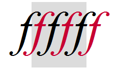
No clipping (transparent text)
The image on the left illustrates the text drawn using an opaque background-fill mode. This is the simplest way to draw text, because the text and background is rendered in one go. This is how Neatpad currently renders text. However problems occur when text is broken up into blocks. Of course the problem is made much worse by the Italic text - for most Roman text this issue never occurs.
SetBkMode(hdc, OPAQUE);
TextOut(hdc, x, y, szText, nTextLen);
The image on the right illustrates the ideal way to display multi-coloured text. In order to render the text this way the process had to be split in two phases. Firstly, the background was drawn in it’s entirety (from left-to-right). Then the text was drawn ’transparently’ over the top of the background.
FillRect(hdc, &backgroundRect);

SetBkMode(hdc, TRANSPARENT);
TextOut(hdc, x, y, szText, nTextLen);
Breaking the text with two phases will introduce flickering, so to remedy this side-effect we must resort to ‘double-buffering’ whenever we draw text. This means that we must draw each line of text into an off-screen buffer before displaying it visually. It is entirely necessary to draw text this way, and this is the direction I am heading in with Neatpad. However the consequence of moving to a double-buffering scheme means we can re-examine how selection-highlights are drawn.
Drawing Selection Higlighting
Selection-highlighting has always seemed to be a rather elusive subject - at least to me. The problem is, there aren’t really any strict guidelines as to how one should represent text-selections, and it was only after delving into the world of Uniscribe and ’low level’ glyph rendering, that I fully understood the issues involved.
The images below illustrate the two main methods of representing text-selection. For the purposes of this example I am using the same string of six ‘F’s. This time however two of the six glyphs are shown as ‘selected’ - using the default Windows system colours.
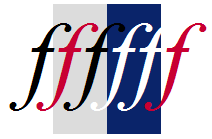
Background highlighting
Inversion highlighting
The two basic strategies can be referred to quite simply as Background highlighting, and Inversion highlighting.
- Background highlighting is the simplest way to represent text-selections. In fact all that is required is to modify the text foreground and background colours to represent the selected range of text. Because the text has been drawn transparently on top of the background, you will notice how the glyphs overhang their character-boundaries. Wordpad and Internet Explorer use this method, as do many other text-editors such as Scintilla.
- Inversion highlighting is more complex to achieve but produces better results (in my opinion). The effect is very similar to the old method of literally inverting the pixels within a rectanglar area. Of course to maintain the standard Windows colour-scheme the selected area is painted normally instead of truely inverting the colours. It also looks as if the selection highlight is on top of the text, rather than behind it. Notepad is a very good example that demonstrates this type of selection-highlighting.
My preference is for the ‘inversion’ method. When text is highlighted I like to think of the selection-rectangle being overlayed on top of the text, rather than being behind it. Personally I don’t like the look and feel of the background-highlighting method. Because of the typical colour-scheme in Windows (white background, white selected text), some selected text seems to disappear when the selection highlight moves over them. If you look closely at the example you can see this effect clearly - because the two selected characters are white, any overlap onto a white background makes it look as if the characters have been truncated. I am moving to the ‘inversion’ method in Neatpad simply because it looks more professional.

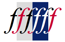
The process of ‘inversion highlighting’ is rather more involved than you might expect. The problem we face is the issue of overhanging characters. In the example above the character is shown as selected - however the leading and trailing edges fall into unselected areas and must be painted in separate colours. When displaying this character in a selected state it must somehow be split apart - with the main character body rendered one way, and the left-and-right overhanging segments rendered diffierently. My solution to this problem is to use a three-phase rendering strategy, which is outlined below.

1a. Background

1b. Mask selected areas
The first stage is to paint the background using a series of simple flat fills. Every character has it’s regular bounding rectangle painted this way, with both normal and selected areas being rendered. An important detail to understand is the use of clipping at this early stage. Any selected-areas are masked immediately after being painted. What this means is that the ExcludeClipRect API is used to remove the selected areas from the current device-context’s clipping-region. The reason why this detail is important will soon become clear.
2a. Normal text

2b. Invert mask
Once the background has been painted in it’s entirety (for all characters/glyphs), the second stage is to render the text over the top. A transparent drawing-mode is used to paint the text (SetBkMode with the TRANSPARENT setting). Because of the clipping-region created during the first pass, any selected (blue) areas are protected as the text is drawn over the them.
After the text been drawn the clipping-region for the device-context is inverted (ExtSelectClipRgn with RGN_XOR), which results in the selected areas becoming unmasked. The text we have just rendered will now be protected from subsequent drawing operations.

3a. Selected text
3b. The result
The final stage is to redraw the text. The exact same text is drawn, directly over the top of the text we just drew. The difference is that the text is drawn in a single colour this time - using the system-highlight colour (i.e. white). Because of the clipping-region we have created, only the selected (blue) areas are modified this time. When the clipping-region removed the drawing is complete. The result is high quality text-output that would be suitable for a word-processing package.
The use of clipping is the key to making this method work. Although it seems as if the text is overdrawn, in reality it is not because of the careful use of clipping-regions. Importantly, when ClearType or another form of anti-aliasing is enabled, using clipping this way is absolutely necessary, because if we really did overdraw the text we would ruin the ClearType effect. Using clipping in the method outlined above protects us from this ‘overdraw’, even though we attempt to draw the text twice.
Of course there are always going to be issues with rendering text this way. Performing three separate passes will introduce a fair amount of flickering and basically dictates that we must use double-buffering when drawing all text. There is also the potential performance-decrease of drawing the text twice. Note however that this last issue can be managed quite easily by only performing this ‘double drawing’ when necessary - most of the time we can avoid drawing text twice (such as when there is no selection in the text, or if all the text is selected).
Although the method I have described here might seem quite strange if you’ve not encountered it before, I can promise you that it is not that unusual. The ScriptString API (and therefore apps like Notepad) use this exact same method, and you can be sure that any text-editing package that uses the ‘inversion method’ will use something very similar also. The point is, there really isn’t any alternative to the method I have chosen. If your goal is high-quality text display then concessions must be made.
Coming up in Part 11!
It should be noted that I have taken an extreme example here. Most English text in a Roman typeface will not require complex rendering such as this - however because we must support all forms of text (especially the more exotic Unicode scripts) we must do things properly from this point on. In fact the inversion-method is entirely necessary for rendering with Uniscribe as we will find out shortly.
This tutorial is really just a preview of things to come. The technique of inversion-highlighting will be incorporated into Neatpad’s text-display engine as we migrate to the Uniscribe API.